What Top Painting Company Websites Have in Common
 Your website is a key factor in how clients perceive your company. Customers visit painting company websites to determine how legitimate the business is, how active they are, what their style is, and what other people are saying about them. They want to get a feel for how professional you are and whether or not you're suitable for the job. Put plainly: there's a lot riding on the content that you publish online. Although everyone's site is different, there are some essential aspects that every great painting company website includes. These frontrunners all follow a similar format in their web design and, most importantly, are successful at pulling in leads. Here are some of the elements that the best painting company websites have in common.
1. Professional design
Your website is a big deal, and it's development shouldn't be entrusted to just anybody. While many business owners opt to create their own websites, there are some good reasons for hiring an experienced professional. Web design companies know how to tailor website content to your industry and target audience. They're familiar with what works and what doesn't, meaning they can lend valuable advice on which features and lead generation mechanisms will be most effective for your brand. Though going with a professional web designer is more costly than building the website yourself, the advantages far outweigh the expenses; your site will be more engaging, and you'll be more likely to attract web traffic and acquire new leads.
2. High-quality photographs
In the home improvement industry, photos are a big part of a successful marketing strategy. Clients want to know that you do good work and that they can trust you to produce the finished product that they're expecting. Because of this, many of the leading painting companies hire professional photographers to capture their favorite projects. Although just about anyone can take a photo on their smart phone or digital camera, using professional photos ensures that you're providing your website visitors with the best possible representation of your work. Sharing pictures that are blurry, pixilated, or badly-lit might deter clients from giving you a call, as they may think you don't care enough to post nice photos or that your work simply isn't up to par. Of course, when seeking out a photographer, be sure to find someone who is specialized in taking photos for your industry. If you want pictures of your latest home improvement project, it's probably not a good idea to hire a photographer who specializes in family portraits.
3. Search engine optimization
Having a super spiffy website isn't going to matter much if nobody sees it. And in order for your website to be seen by potential clients, it's got to be sufficiently optimized in search results. Search engine optimization (SEO) refers to how well you rank on Google and other search engine sites. To rank highly, you've got to build a site that exhibits original and relevant content, using keywords that pertain specifically to your target audience. Effectively managing your SEO requires a lot of time, effort, and trial and error. We highly recommend speaking with an internet marketing expert, but if you want the basics, check out our blog on improving your painting company's SEO.
4. Service-specific pages
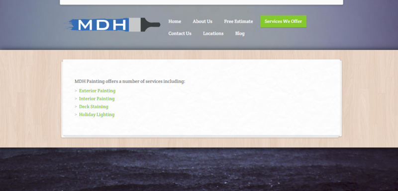
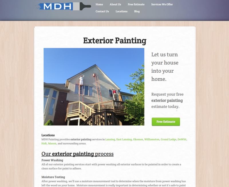
Listing the services you provide in one place offers some information, but it doesn't give your clients the full picture. Many of the most successful (and highest-ranking) painting websites have taken to creating individual pages for each of their services. This produces more specific and relevant content for both clients and search engines. For example, take a look at the website for MDH Painting. Along with giving a brief list of the services they offer, they also supply links to more detailed service pages, demonstrating their expertise and allowing visitors to get a better feel for what that service entails.


By delving more deeply into the specific elements of their services, the company stands to establish greater client trust, as well as a better ranking in search results.
5. Clear calls to action
A great painting website is incomplete without clear and consistent calls to action (CTAs) on every page. Even if a customer is interested in your services, if there aren't several buttons or banners urging them to take the next step, they might not know what action they're supposed to take. Your site should continually encourage visitors to 'find out more', 'contact us', or 'get an estimate' -- anything to guide that person down the sales funnel and turn them into a lead. It's true that "the squeaky wheel gets the grease". By guiding visitors in the right direction, your website can help you to draw in more prospects and, ultimately, convert more of those prospects into paying customers.
What's next?
Using CRM Software to Kickstart Your New Business As the proud owner of a brand-new business, you've probably got a number of concerns. These may include (but are likely not limited to): How can I put myself out there? What resources are at my disposal? What is the value of these resources? And, perhaps...Continue Reading
6 Reasons to Prioritize Digital Marketing Over Traditional Advertising It's no secret that the world of marketing is ever-evolving. In fact, much has changed recently in terms of which advertising methods are most effective. In the past, most contractors marketing their services via newspaper, television, radio, and other traditional...Continue Reading